Looking for the exact OpenSea banner size?
Or perhaps you’ve already followed OpenSea’s recommendations but your profile’s banner still looks ugly and cropped?
You’re definitely not alone and it’s become a bit of an annoyance for many people who use OpenSea.
There’s no need to worry though because we’ve had a closer look at the exact specifications and we’ve experimented with different OpenSea banner sizes as well as varying browser sizes.
In this guide, we’ll show you exactly what banner size you need to choose in order to get the most out of your OpenSea banner and we’ve even created a template for you to use.
Let’s dive right into it.
Key Points (tl;dr)
- OpenSea recommends a collection and profile banner size of 1400×400 pixels, however many users have complained that this ends up cropping their banner too much and is sometimes blurry.
- You can fix this by understanding how responsive design works and using our 2800×800 pixel banner template instead.
- Using a larger size can also reduce the blur effect because the higher resolution is downscaled into a sharper-looking image.
- You can download our banner template as PNG, SVG, Adobe Illustrator and Affinity Designer by clicking here.
Like this content? Then share it!
Solved: OpenSea Banner Size + Template
www.tokenizedhq.com
Here’s the answer. Great article by @ChrisHeidorn right here: https://tokenizedhq.com/opensea-banner-size/
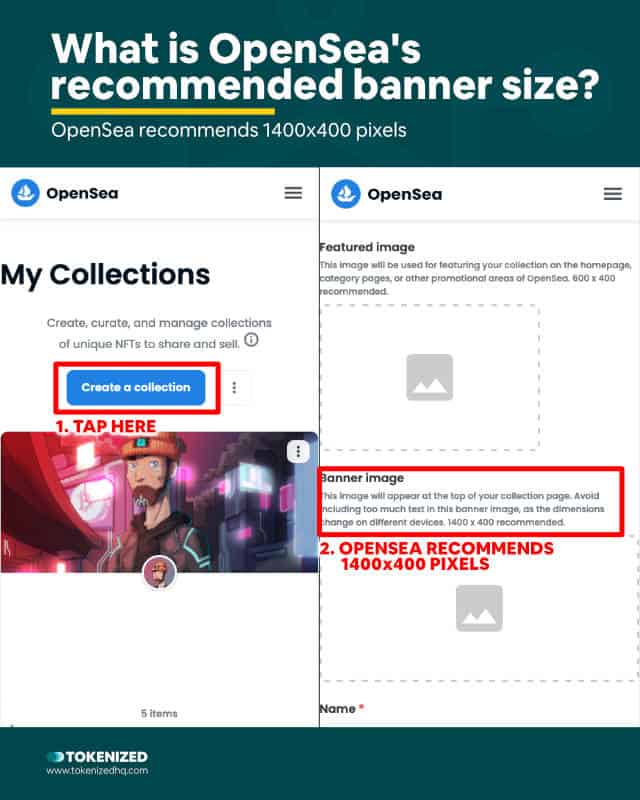
OpenSea officially recommends a banner image size of 1400×400 pixels. These dimensions are considered to be optimal for most devices. OpenSea recommends 600×400 pixels for featured images and 350×350 for the logo image of your profile.

Back in the day, it was not uncommon to create different types of website designs that were optimized for a number of different devices.
It was a tedious and difficult task but it made sense because the number of different browser window sizes was still limited.
Nowadays it’s considered best practice to build so-called “responsive” websites which are able to adapt to all sorts of different browser sizes.
This approach has become essential due to the exponential increase in different devices.
Responsive websites usually look decent on any device and usability is considered more important at this stage.
The problem with responsive websites and custom imagery is that banner images rarely fall perfectly into place.
For many users, this can be quite frustrating as they alternate between desktop browsers and their mobile devices and don’t understand why their OpenSea banner looks different every time.
The official recommended banner size for the OpenSea NFT marketplace is 1400×400 pixels, however, depending on what you’ve put on your banner, this isn’t necessarily optimal at all.
Many people have also complained that their banners look blurry after uploading the recommended OpenSea banner size.
In the following, we’ll tackle of some these issues and present you with solutions that actually work.
How to Fix Your OpenSea Banner Size
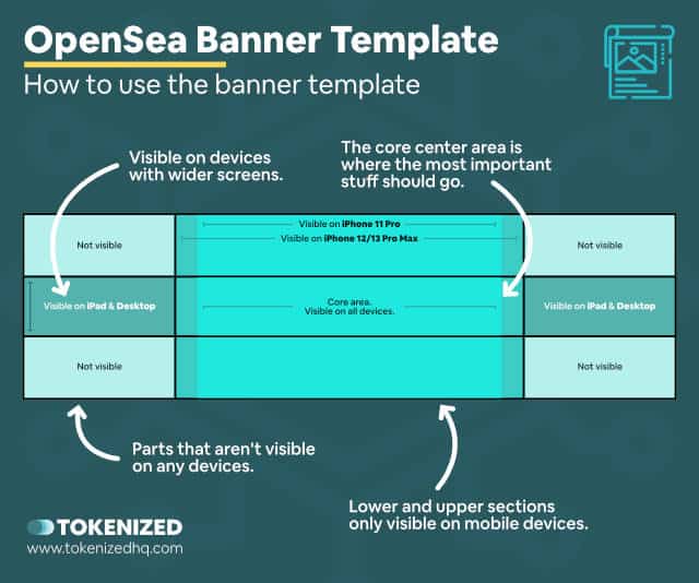
You can optimize your OpenSea banner for various devices by using a banner size of 2800×800 pixels and focusing the important elements of the banner’s design on the center of the banner. You can use our banner template to optimize your design for different types of devices.

Since there are so many different browser sizes, it’s very difficult to find the perfect OpenSea banner dimensions for everyone.
However, we’ve done a lot of testing and we’ve managed to identify which areas of your banner will never be displayed, no matter which device you use.
We’ve also identified the core area within the banner which will almost always show up on any device.
The key thing to remember when creating your OpenSea banner is that you need to place the most important parts in a specific area.
We also recommend using an OpenSea banner size of 2800×800 pixels, so exactly twice the recommended size.
We’ll explain the reason for this a little later in this guide.
You can use our OpenSea banner size template in order to create a banner that is more likely to fix your problem.
It’s not perfect, but it works.
You can download our template in 4 different file formats: PNG format, SVG format, Adobe Illustrator, or Affinity Designer by clicking here or the red button below.
You’ll receive a download link straight in your inbox.
Oh and by the way, if you’re looking for a similar template like this with the optimal Discord banner size, we’ve got a guide on that too.

How to Fix a Blurry OpenSea Banner
OpenSea’s recommended banner size can result in blurry images on some devices. While you cannot completely eliminate this effect, using an OpenSea banner size of 2800×800 pixels (twice the recommended size) will usually make your image look sharper.
Apple devices usually have something that is called a “Retina” screen.
Retina was introduced back in 2012 with the new line of MacBook Pros.
It’s been a standard feature of all new Apple devices since then.
Retina screens look sharper than other screens simply because all of the imagery is created at twice the resolution of the screen and then simply downscaled.
It’s the exact opposite effect of upscaling an image that gets increasingly blurry.
Your OpenSea banner might look blurry on your device simply because the artwork you uploaded was too small for your device’s screen resolution.
Another reason is most likely the fact that OpenSea uses a strong compression algorithm to optimize the images uploaded to their platform.
That’s why we recommend using OpenSea banner dimensions of 2800×800 pixels instead of the official 1400×400.
Conclusion
Many users feel that OpenSea’s recommend banner size is actually wrong or at the very least makes their banners look ugly and cropped.
While they aren’t wrong, the root cause mainly lies within today’s responsive web design.
Responsive web design aims to create user interfaces that are optimized for as many different devices as possible.
As a result, it never looks quite perfect but it looks good enough for most people.
The easiest way to fix this is to use our OpenSea banner template and make sure you place the core elements of your banner in the right area.
We hope you find our template helpful and look forward to hearing your feedback.
Here at Tokenized, we want to help you learn as much as possible about the coming NFT revolution. We help you navigate this fascinating new world of non-fungible tokens and show you how you can integrate tokenization into your own business.


