So you’ve started to place your character into various scenes.
But for some reason, the outfit keeps changing in every single image in Midjourney.
This is one of the biggest challenges you’ll face when you work exclusively with text prompts.
The good news is that you can partially fix this by applying some unconventional methods while building out your storyboards.
In this guide, we’ll show you how to use image prompts and multiprompts to create more elaborate scenes while ensuring that your characters look almost always the same.
Let’s dive right in.
Table of Contents Show

Like this content? Then share it!
How to Apply a Consistent Character Style in Midjourney
www.tokenizedhq.com
Here’s the answer. Great article by @ChrisHeidorn right here: https://tokenizedhq.com/midjourney-consistent-character-style/
How to Apply Characters in Action Scenes in Midjourney
This guide is part of a larger series that covers character design in Midjourney.
If you haven’t read Parts 1 and 2 of our series, I strongly recommend you check them out.
They cover everything you need to know about creating your very first consistent character in Midjourney as well as placing your character in action scenes.
They will also provide more context on what I’m about to show you in this part of the series.
Before we jump in, I’d like to start off with some good old expectation management.
While all of the methods I’m about to show you definitely work, not all of them are necessarily suitable for every situation.
In fact, some of them have significant drawbacks, so please don’t expect them to solve every single problem.
Truth be told, all of these methods are far from perfect.
Some of them also take considerably more time and require you to make some edits outside Midjourney.
So be prepared to get your hands dirty, because things are about to get a lot more complex.
So with that said, let’s kick things off or simply watch the YouTube video here.
Key Points (tl;dr)
- There are a number of unconventional methods for maintaining a consistent character style across many scenes.
- Method 1: Use a single image reference to lock in your preferred style.
- Method 2: Use both style and composition references for different scenes.
- Method 3: Combine multiprompts with style and composition references for maximum control over your results.
Creating Initial Character Concepts
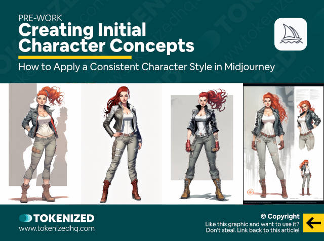
We are going to start by creating some new concept art for Carla.
We need her in various different poses and angles.
So first, I’m going to create a full-body character with the following prompt:
/imagine glamour shot full body image, beautiful woman, bright red braided bun hair, only red hair, wearing a leather jacket in gray color, wearing a white tank top under jacket, wearing beige pants on legs, in the style of a Marvel comic book --ar 2:3 --seed 2385530314Normally I wouldn’t use a seed for this and simply re-roll until I find a good image.
But since I already prepared these examples in advance, I want to recover the exact images I used.
However, technically, it’s not really necessary.
From this set of 4 images, I’m going to pick the top left one and upscale it.
Once that’s done, I’m going to open it in a separate tab just for ease of use because we’ll need it later on.
Next, I’m going to create another character concept but from a closer angle by using the following prompt.
/imagine glamour shot full body image, beautiful woman, bright red braided bun hair, only red hair, wearing a leather jacket in gray color, wearing a white tank top under jacket, in the style of a Marvel comic book --ar 2:3 --seed 3493679237From these 4 images I’ll upscale the bottom left one because it’s closest to the earlier image and it’s exactly the art style that I want.
Once again, when it’s done upscaling, I’ll open it in a new tab for later use.
Now I’m going to create one more concept which is a portrait by using this prompt:
/imagine close up face of beautiful woman, bright red braided bun hair, only red hair, wearing a leather jacket in gray color, wearing a white tank top under jacket, in the style of a marvel comic book::1 photorealistic, text, title, headline, typography, words::-0.5 --ar 2:3 --seed 1417083315The second segment is a negative prompt that is meant to eliminate any form of text that may appear in the images.
From this set of 4, I’ll pick the bottom left one again and upscale it.
And you guessed right, I’ll open it in a separate tab again.
Now that I’ve generated these 3 concepts, I’m going to blend them all together using this prompt:
/imagine https://s.mj.run/IxN94lGxf48 https://s.mj.run/bXu6MefSl5E https://s.mj.run/oQ8_cTr0seQ glamour shot full body image, beautiful woman, bright red braided bun hair, only red hair, wearing a leather jacket in gray color, wearing a white tank top under jacket, wearing beige pants on legs, in the style of a Marvel comic book --ar 2:3 --seed 807034743Technically, you don’t need to do this, but based on my personal experience, it usually gives me the best results.
Consider this step optional, but I’m going to be using the bottom left image of Carla throughout the rest of this guide.
So let’s upscale the image and open it in a new tab
Awesome, we’re now ready to start styling our existing scenes, as well as creating entirely new ones.
Applying a Character Style to Existing Scenes
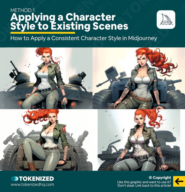
Remember that scene with Carla sitting on top of a tank from Part 2 of this series?
Let’s take the original prompt, including the seed, and simply add our blended “Carla” style concept as an image prompt.
/imagine https://s.mj.run/x0E-FkQeZew wide angle shot full body image, beautiful woman, bright red braided bun hair, wearing a leather jacket in gray color, only red hair, in the style of military comic book, sitting on top of an army tank --ar 3:2 --seed 3472746910And voilà, here is our tank scene, recreated with the specific Carla style that we wanted.
Or maybe you remember the battlefield scene that we created?
Let’s apply this new look to that.
/imagine https://s.mj.run/x0E-FkQeZew wide angle shot full body image, beautiful woman, bright red braided bun hair, wearing a leather jacket in gray color, only red hair, feet on the ground, in the style of military comic book, running across the battlefield while aiming and shooting a gun at a target --ar 3:2 --seed 3472746910Looks pretty good, doesn’t it?
Creating New Scenes with a Specific Character Style
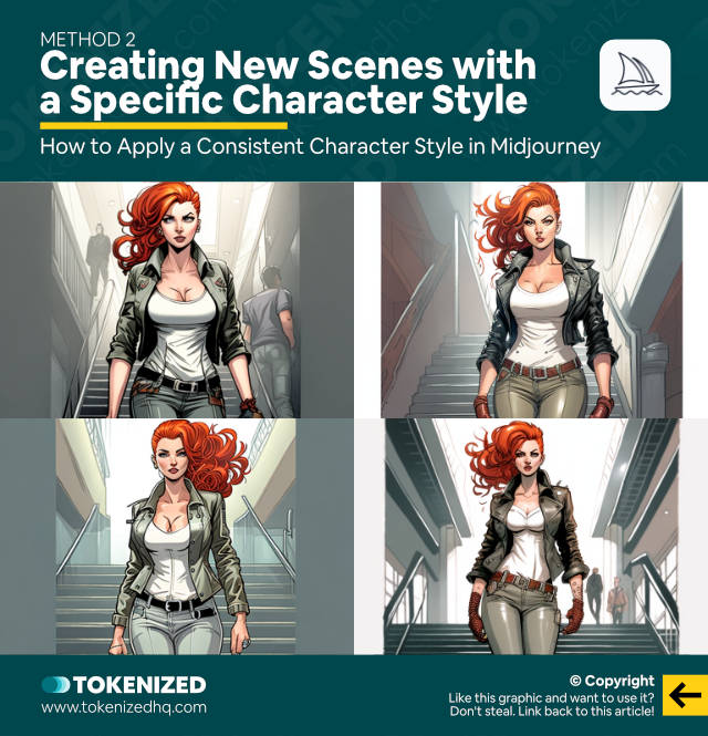
So now let’s try to create something entirely new.
I’m going to let Carla walk down a flight of stairs with this prompt.
/imagine https://s.mj.run/x0E-FkQeZew wide angle shot full body image, beautiful woman, bright red braided bun hair, only red hair, wearing a leather jacket in gray color, wearing a white tank top under jacket, wearing beige pants on legs, in the style of a Marvel comic book, walking down a flight of stairs inside a modern government building --ar 3:2 --seed 2130628427Now, while this looks like our Carla, you may have noticed the lines on the side.
The images look like they were cropped.
This is one of the major weaknesses of this method.
There are effectively 3 problems here.
- For one, we are using an image prompt in portrait format, but the prompt asks for a landscape format. They’re not really compatible and this is what happens.
- The second problem is the fact that our image prompt has too much white in the background. This information is translated into what you see here.
- And the third issue is that the image prompt has a disproportionate impact on the overall composition of the image.
Carla is more or less always in the middle and the scenes aren’t very dynamic.
Let me show you another example:
/imagine https://s.mj.run/x0E-FkQeZew aerial shot, woman with red hair standing on a rock, looking at an alpine panorama, blue sky, lush green grass below her --ar 3:2 --seed 3791191149It might not be as obvious here because there’s a lot more going on in the image, but notice how the sky is incredibly white.
This is mainly due to the image prompt.
The overall style of the image is also slightly different because the structure of our prompt has changed significantly.
We’ve provided a lot less information, especially regarding Carla’s features.
So let me show you how you can sort of fix this.
Using Style & Composition References
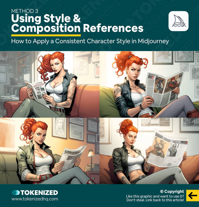
I want to create an image of Carla sitting on a couch, reading a newspaper, but without using an image prompt.
/imagine wide angle shot of room, beautiful woman, bright red braided bun hair, only red hair, wearing a leather jacket in gray color, wearing a white tank top under jacket, wearing beige pants on legs, in the style of a Marvel comic book, reading a newspaper while sitting on a couch --ar 3:2 --seed 4187963255The benefit of this approach is that it allows me to create a new reference image that has the right format and also shows a woman that looks more or less like Carla.
I’m going to use the bottom left one and upscale it to use it as a reference.
You don’t necessarily have to do this and could technically just react with the envelope icon and use the smaller version of the image.
But I’m sometimes under the impression that it delivers better images.
Next, we’re going to use this image as our first image prompt.
Then we’ll add our original style reference as a second image prompt, followed by the text prompt.
/imagine https://s.mj.run/LXwvsWis9G4 https://s.mj.run/x0E-FkQeZew wide angle shot of room, beautiful woman, bright red braided bun hair, only red hair, wearing a leather jacket in gray color, wearing a white tank top under jacket, wearing beige pants on legs, in the style of a Marvel comic book, reading a newspaper while sitting on a couch --ar 3:2 --seed 3126959669And as you can see, the results look a little more diverse and not necessarily as centered as before.
You can do this with pretty much any sort of scene or activity that you want your character to do.
However, you’ll also notice that due to the reference images, you’re a bit limited in terms of composition.
Adding Context with Multiprompts
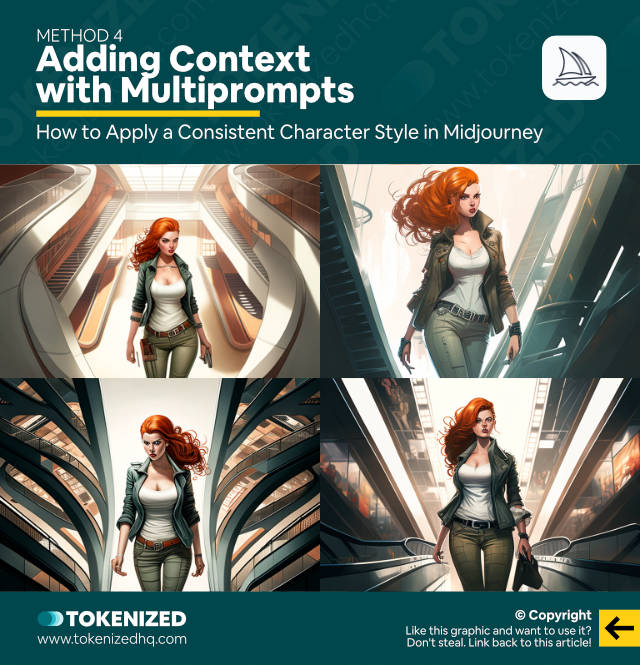
Now, if you’d like to zoom out a little more and add a lot more context to the location where your character is, then here’s an approach that works quite well.
You’ll also avoid having to upscale a new reference image.
I want to place Carla in a shopping mall, standing on an escalator.
We’re going to use multiprompts for this.
Let’s start off by creating a diverse shopping mall scene.
/imagine aerial view, well-lit atrium of a shopping mall, large escalator in the middle of an atrium viewed from the side --ar 3:2 --seed 96635039This is going to be the concept for our first segment and it represents the location we want.
Our second segment will focus on a red-haired woman standing on an escalator.
/imagine side angle shot, red-haired woman walking up an escalator --ar 3:2 --seed 776887272Bear in mind, you do not need to create these images separately.
I am only doing this in order to show you what the concepts look like in isolation.
Normally, I would have simply entered the multiprompt like this:
/imagine aerial view, well-lit atrium of a shopping mall, large escalator in the middle of an atrium viewed from the side, surrounded by dozens of people::1 side angle shot, red-haired woman standing on escalator::1 --ar 3:2 --seed 3692462021Each concept represents one of the two segments and each segment is given a weight of 1.
The multiprompt blends them together and gives us this set of images.
Again, I’m only doing this to show you what they look like.
You could easily skip all these steps and simply enter the full prompt, including the image reference at the front.
/imagine https://s.mj.run/x0E-FkQeZew aerial view, well-lit atrium of a shopping mall, large escalator in the middle of an atrium viewed from the side::1 side angle shot, red-haired woman walking up an escalator::1 --ar 3:2 --seed 2790657882This actually looks pretty good.
However, the extremely centric and symmetrical composition is still an annoyance.
That’s why we’re going to move on to the most challenging and complex method yet.
Constructing Complex Multiprompts
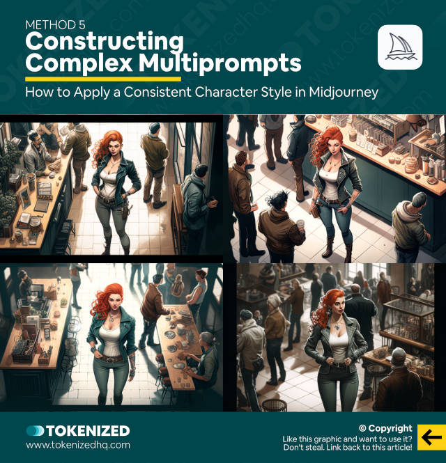
I want to position Carla inside a coffee shop full of people and ideally, she should be queuing for some coffee.
So let’s start by creating the inside of the coffee shop and I’m going to use multiprompts for this.
Here’s the first segment:
/imagine panoramic view of a industrial-chic coffee shop buzzing with guests --ar 3:2 --seed 2048534411If you look at the images, this is exactly what I was looking for.
Next, let’s create another segment that sounds similar, but I’m going to phrase it differently and I’m also going to use a different angle.
/imagine aerial shot of the inside of an hipster coffee shop with many customers --ar 3:2 --seed 272609642This time we get a birds-eye view, which is really great because it allows us to blend them together to get an “average” of both angles.
Don’t believe that it’s possible?
Let me show you.
/imagine panoramic view of a industrial-chic coffee shop buzzing with guests::1 aerial shot of the inside of an hipster coffee shop with many customers::1 --ar 3:2 --seed 3150545719What did I tell you?
This is a great example of how powerful multiprompts can be when you use them correctly.
But we’re not done yet.
We’re going to add one more concept that looks like this in isolation:
/imagine aerial shot from a distance of a beautiful red-haired woman standing in line for a cup of coffee --ar 3:2 --seed 79481518It’s a bit of an odd image, but let’s use it nonetheless.
So our full multiprompt would look like this:
/imagine https://s.mj.run/x0E-FkQeZew panoramic view of a industrial-chic coffee shop buzzing with guests::1 aerial shot of the inside of an hipster coffee shop with many customers::1 aerial shot from a distance, beautiful red-haired woman standing in line for a cup of coffee::2 --ar 3:2 --seed 1963196275I’ve also added our Carla reference image at the front and since I want to emphasize the third segment with the girl a bit more, I’ll give it a weight of 2.
This makes sure that the other elements of the prompt aren’t too overbearing.
Now, as you can see, we’ve successfully managed to position Carla in the coffee shop at an angle.
However, she’s just way too tall and that’s mainly the fault of our image reference.
Her character is far too dominant.
So here’s what I did.
Using a Custom Composition Reference
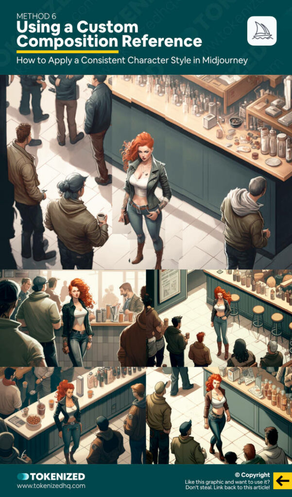
I decided that I like the composition of the top right image, so I upscaled it.
As you can see, she’s just way too tall.
The most effective way to fix this is to open this image in an image editor such as Photoshop or Affinity Photo.
To be clear, we are not going to create the final image in an editor.
We are just tweaking it into a better image reference.
So after my edits, here’s what the image looks like.
I’ve reduced Carla’s height so that it’s more similar to the other characters.
Then I filled the blank space behind her by cloning other elements of the image.
I then saved this image and uploaded it into Discord so that I could retrieve the URL as a reference image.
We’re going to use it to replace the image reference of Carla that we’ve used throughout this video.
But if that’s all we do then I already know that Carla is going to look really ugly.
So we also need to add an additional segment to the prompt.
Our prompt will now consist of 1 image prompt and 4 text prompt segments.
Here’s what they are:
/imagineStarting with our image prompt.
https://s.mj.run/aPaypTRypEMFollowed by our first text prompt segment.
panoramic view of an industrial-chic coffee shop buzzing with guests::1Then our second segment.
aerial shot of the inside of a hipster coffee shop with many customers::1Our third segment, but this time only with a weight of 1 instead of 2.
aerial shot from a distance, beautiful red-haired woman standing in line for a cup of coffee::1And finally, our original Carla prompt from Part 1 and 2, extended by the activity “standing in line for a cup of coffee”.
aerial shot from a distance, beautiful woman, bright red braided bun hair, only red hair, wearing a leather jacket in gray color, wearing a white tank top under jacket, wearing beige pants on legs, in the style of a Marvel comic book, standing in line for a cup of coffee::6We’re also going to give this segment a weight of 6.
How much weight you give each segment is a matter of trial and error.
So, believe it or not, our full prompt literally looks like this:
/imagine https://s.mj.run/aPaypTRypEM panoramic view of an industrial-chic coffee shop buzzing with guests::1 aerial shot of the inside of a hipster coffee shop with many customers::1 aerial shot from a distance, beautiful red-haired woman standing in line for a cup of coffee::1 aerial shot from a distance, beautiful woman, bright red braided bun hair, only red hair, wearing a leather jacket in gray color, wearing a white tank top under jacket, wearing beige pants on legs, in the style of a Marvel comic book, standing in line for a cup of coffee::6 --ar 3:2 --seed 3516828705I’m not kidding, I’m dead serious.
Here’s what the result looks like.
You can obviously argue that Carla’s facial features are a lot less detailed now and possibly not exactly like the original.
On the other hand, this shot is at a much greater distance and the comic book style obviously impacts how much detail a face will have.
Did I overpromise when I said that this video would show you some unconventional methods?
If you enjoyed the complexity of the last example, then wait until I show you what else multiprompts can do.
Part 4 of this series is going to be all about multiprompts and multi-character scenes.
How to Use Multiple Characters in Midjourney
Frequently Asked Questions (FAQ)
Before we close off this guide, let’s quickly address some of the most common questions related to consistent character styles in Midjourney.
-
How do you get a consistent style in Midjourney?
One way of keeping a consistent character style in Midjourney is to prepend your prompts with image references of the exact style that you want. While this does tend to impact the overall composition of your images, it is the most effective way of ensuring a consistent character, outfit, and art style.
-
How do you keep character designs consistent?
The best way to keep a character consistent in Midjourney is to provide as much detail about your character as possible via the text prompt. You will still see slight differences in their style but this can be fixed with image references.
Conclusion
Maintaining a consistent character style across many different scenes is pretty difficult to achieve.
And even though the methods I’ve shown you here work fairly well, they have a fair amount of shortcomings.
As you can see, creating more elaborate projects with AI art generators is actually a lot more difficult than most people think.
Here at Tokenized, we want to help you learn as much as possible about the AI software industry. We help you navigate the world of tech and the digitalization of our society at large, including the tokenization of assets and services.


